is an innovative add-on for Concrete CMS that allows for the easy integration of a block using SwiperJS - a powerful, modern library for creating swipeable carousels.
Installation Instructions
Unzip this file in your site's packages/ directory.
Login to your site as an administrator.
Find the "Extend concrete5" page in your dashboard.
Find this package in the list of packages awaiting installation.
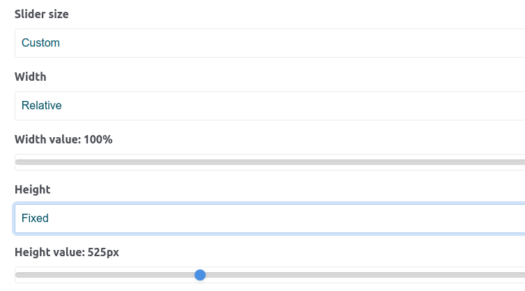
To ensure that Zen Swiper displays correctly when using the 'vertical' direction setting, you need to set a fixed height instead of using a percentage-based height.
You can also set a fixed height for the surrounding div element that contains Zen Swiper, either in pixels (e.g., 'px') or as a percentage of the viewport height (e.g., '100vh').
Sample settings:
Change "slider size" to 'custom.' Set 'height' to 'fixed.' Change 'Height value' to appropriate value.
When using the 'fade' transition effect, please note that you can have only one slide per view and one slide per group. The settings 'centered slides,' 'Space between slides,' and 'Slide to clicked slide' are not available for this transition.
Sample settings:
- space between
- effect: "fade"
- check "Navigation"
- check "Pagination"
- clickable (true)
When using the 'cube' transition effect, please note that you can have only one slide per view and one slide per group. The settings 'centered slides,' 'Space between slides,' and 'Slide to clicked slide' are not available for this transition.
In the case of the cube effect, images are attached to the sides of the cube starting from the top-left corner. To ensure that the cube's sides are fully covered by the images, the images should be equal to or larger than the cube's sides. It's also a good practice to make sure that the images are of the same size for consistency.
You can achieve this effect using custom CSS as follows:
Effect flip:
When using the 'flip' transition effect, please note that you can have only one slide per view and one slide per group. The settings 'centered slides,' 'Space between slides,' and 'Slide to clicked slide' are not available for this transition.
To ensure proper accessibility and SEO optimization for images in your Zen Swiper block, you can set the alt attribute for each image displayed in the slider. The alt attribute provides alternative text for the image if it fails to load, and it is also used by screen readers for visually impaired users.
Here’s how to add the alt attribute for images in Zen Swiper:
Steps to Set the alt Attribute:
Log in to Concrete CMS:
Access the Concrete CMS dashboard as an administrator.
Navigate to the File Manager:
Go to the File Manager from the dashboard or the page you are editing.
Select the Image:
Find and click on the image you want to add the alt text for.
Edit the Image:
Once the image is selected, you will see options to edit the image properties.
Set the Description:
In the Description field, enter the alternative text you want to use for the image. This description will be used as the alt attribute in the Zen Swiper slider.
Save Changes:
After adding the description, save the changes. The description you provide will automatically be applied as the alt text for the image when it is displayed in the Zen Swiper slider.
Why Add an alt Text?
Accessibility: The alt text helps visually impaired users understand the content of the image through screen readers.
SEO: Search engines use the alt attribute to index images, which can improve your website's search engine ranking.


 You can also set a fixed height for the surrounding div element that contains Zen Swiper, either in pixels (e.g., 'px') or as a percentage of the viewport height (e.g., '100vh').